Chandelier color affects more than style. It changes how heavy or light the fixture feels, how it relates to the room palette, how it reflects light, and how formal, warm, or modern the room becomes. That is why chandelier color should never be picked in isolation from the interior around it.
Key Takeaways
- Chandelier color affects visual weight as much as decorative style.
- Warm metallics, black finishes, white finishes, and glass-based looks all create different room moods.
- The right chandelier color depends on the room palette, material mix, and desired contrast.
- Matching perfectly is not always necessary, but visual harmony is.
- Finish tone should support the room, not fight it.
Why Chandelier Color Matters
A chandelier often sits in the most visually commanding position in the room. Because of that, its color or finish immediately affects the ceiling story and the broader interior mood. Dark finishes can feel bold and sculptural. Warm metallic finishes can feel rich and inviting. White or pale finishes can feel lighter and quieter.
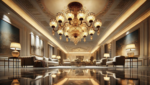
Warm Metallics
Gold, antique brass, and champagne tones usually add warmth and decorative richness. They work especially well in spaces that already contain warm woods, beige tones, layered fabrics, or luxury-oriented material palettes.
Black and Dark Finishes
Black chandeliers often read as more graphic and architectural. They can create strong contrast in lighter rooms and suit minimalist, industrial, or sharply contemporary settings. The risk is visual heaviness if the room is already dark or visually dense.
White and Soft Neutral Finishes
White chandeliers usually feel lighter and more understated. They can work well in softer, coastal, Scandinavian, or restrained contemporary interiors where the goal is calmness rather than drama.
Chrome and Cooler Metallics
Chrome and silver tones feel cleaner and cooler. They can support modern interiors, reflective materials, and blue-gray palettes especially well. They are often better when the room already leans crisp rather than warm.
How to Decide More Confidently
- look at your floor, wall, and furniture tones first
- decide whether the chandelier should blend in or stand out
- consider whether the room needs warmth, contrast, or restraint
- match the finish family loosely, not obsessively
Common Mistakes
- choosing chandelier color only from product photos
- overmatching every finish in the room until the space feels flat
- using a dark chandelier in a room that already feels visually heavy
- using a bright metallic finish without enough supporting warm tones nearby
Frequently Asked Questions
Does chandelier color really affect the room that much?
Yes. Because chandeliers occupy a prominent visual position, their finish tone has a strong influence on mood and balance.
Should a chandelier match the room hardware exactly?
Not necessarily. It should feel related to the space, but exact duplication is not always the best result.
When should I choose a black chandelier?
When the room benefits from stronger contrast or a more graphic architectural statement.
When do warm metallic chandeliers work best?
They usually work best in interiors with warmer palettes, richer materials, and a more inviting decorative tone.
Further Reading
Explore More
Explore Jagmag Lights? chandelier collection and the project archive to compare how finish tone changes decorative lighting in real spaces.